Branding
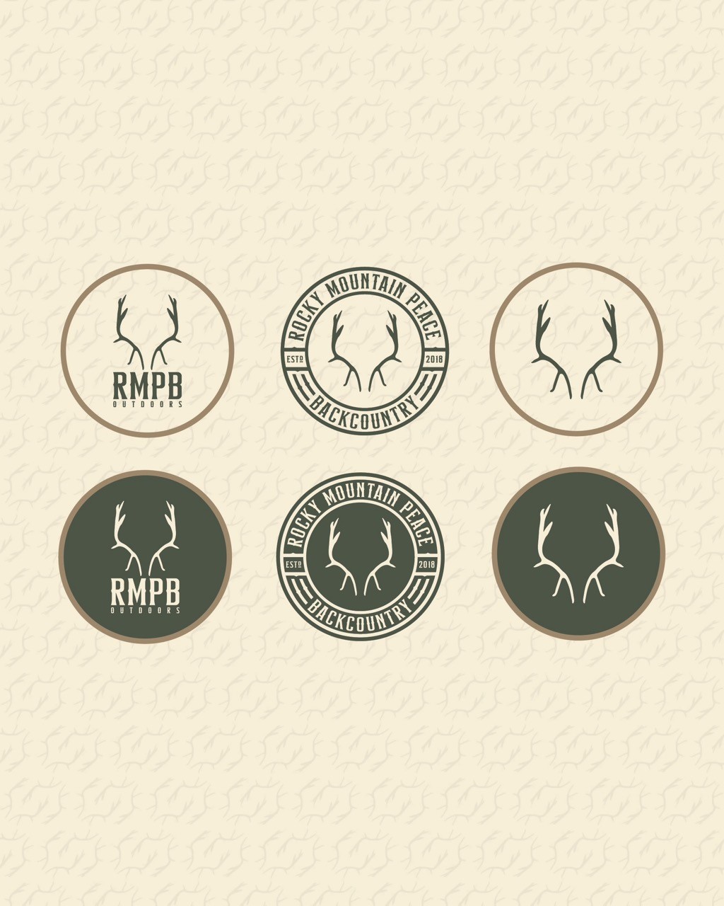
Visual Identity: RMPB Outdoors
A bold and personal brand identity inspired by the outdoors. Centered around a detailed illustration of the team’s harvested bull elk, the design blends rugged and modern elements with earthy tones and adventure-inspired typography to capture the true spirit of backcountry exploration.
Year :
2025
Industry :
Outdoors/Hunting
Client :
Rocky Mountian Peace Backcountry Outdoors
Project Duration :
1 Week

Overview
Rocky Mountain Peace Backcountry Outdoors needed a brand identity that captured the true spirit of the wilderness. The goal was to design something rugged yet refined, rooted in authenticity and ready to live across apparel, digital platforms, and outdoor spaces.

The Design
The identity centers around a detailed illustration of the exact bull elk harvested by the team, turning a personal story into a powerful visual symbol. Paired with bold, adventure-inspired typography and a natural color palette of Wilderness Green and Stone Charcoal, the design feels grounded, timeless, and distinctly backcountry.

The Strategy
The creative direction focused on blending modern design precision with the raw energy of outdoor exploration. The goal was to create a system that works seamlessly across all touchpoints, giving the brand flexibility while maintaining a cohesive, recognizable presence that connects with outdoor enthusiasts.
The Meaning
At its core, this identity represents connection — to nature, to experience, and to the pursuit of adventure. The elk illustration stands as a reminder of respect for the land, the stories we carry from it, and the lasting bond between people and the wilderness.


More Projects


Branding
Visual Identity: RMPB Outdoors
A bold and personal brand identity inspired by the outdoors. Centered around a detailed illustration of the team’s harvested bull elk, the design blends rugged and modern elements with earthy tones and adventure-inspired typography to capture the true spirit of backcountry exploration.
Year :
2025
Industry :
Outdoors/Hunting
Client :
Rocky Mountian Peace Backcountry Outdoors
Project Duration :
1 Week
Overview
Rocky Mountain Peace Backcountry Outdoors needed a brand identity that captured the true spirit of the wilderness. The goal was to design something rugged yet refined, rooted in authenticity and ready to live across apparel, digital platforms, and outdoor spaces.
The Design
The identity centers around a detailed illustration of the exact bull elk harvested by the team, turning a personal story into a powerful visual symbol. Paired with bold, adventure-inspired typography and a natural color palette of Wilderness Green and Stone Charcoal, the design feels grounded, timeless, and distinctly backcountry.
The Strategy
The creative direction focused on blending modern design precision with the raw energy of outdoor exploration. The goal was to create a system that works seamlessly across all touchpoints, giving the brand flexibility while maintaining a cohesive, recognizable presence that connects with outdoor enthusiasts.
The Meaning
At its core, this identity represents connection — to nature, to experience, and to the pursuit of adventure. The elk illustration stands as a reminder of respect for the land, the stories we carry from it, and the lasting bond between people and the wilderness.
More Projects
Branding
Visual Identity: RMPB Outdoors
A bold and personal brand identity inspired by the outdoors. Centered around a detailed illustration of the team’s harvested bull elk, the design blends rugged and modern elements with earthy tones and adventure-inspired typography to capture the true spirit of backcountry exploration.
Year :
2025
Industry :
Outdoors/Hunting
Client :
Rocky Mountian Peace Backcountry Outdoors
Project Duration :
1 Week
Overview
Rocky Mountain Peace Backcountry Outdoors needed a brand identity that captured the true spirit of the wilderness. The goal was to design something rugged yet refined, rooted in authenticity and ready to live across apparel, digital platforms, and outdoor spaces.
The Design
The identity centers around a detailed illustration of the exact bull elk harvested by the team, turning a personal story into a powerful visual symbol. Paired with bold, adventure-inspired typography and a natural color palette of Wilderness Green and Stone Charcoal, the design feels grounded, timeless, and distinctly backcountry.
The Strategy
The creative direction focused on blending modern design precision with the raw energy of outdoor exploration. The goal was to create a system that works seamlessly across all touchpoints, giving the brand flexibility while maintaining a cohesive, recognizable presence that connects with outdoor enthusiasts.
The Meaning
At its core, this identity represents connection — to nature, to experience, and to the pursuit of adventure. The elk illustration stands as a reminder of respect for the land, the stories we carry from it, and the lasting bond between people and the wilderness.