Branding
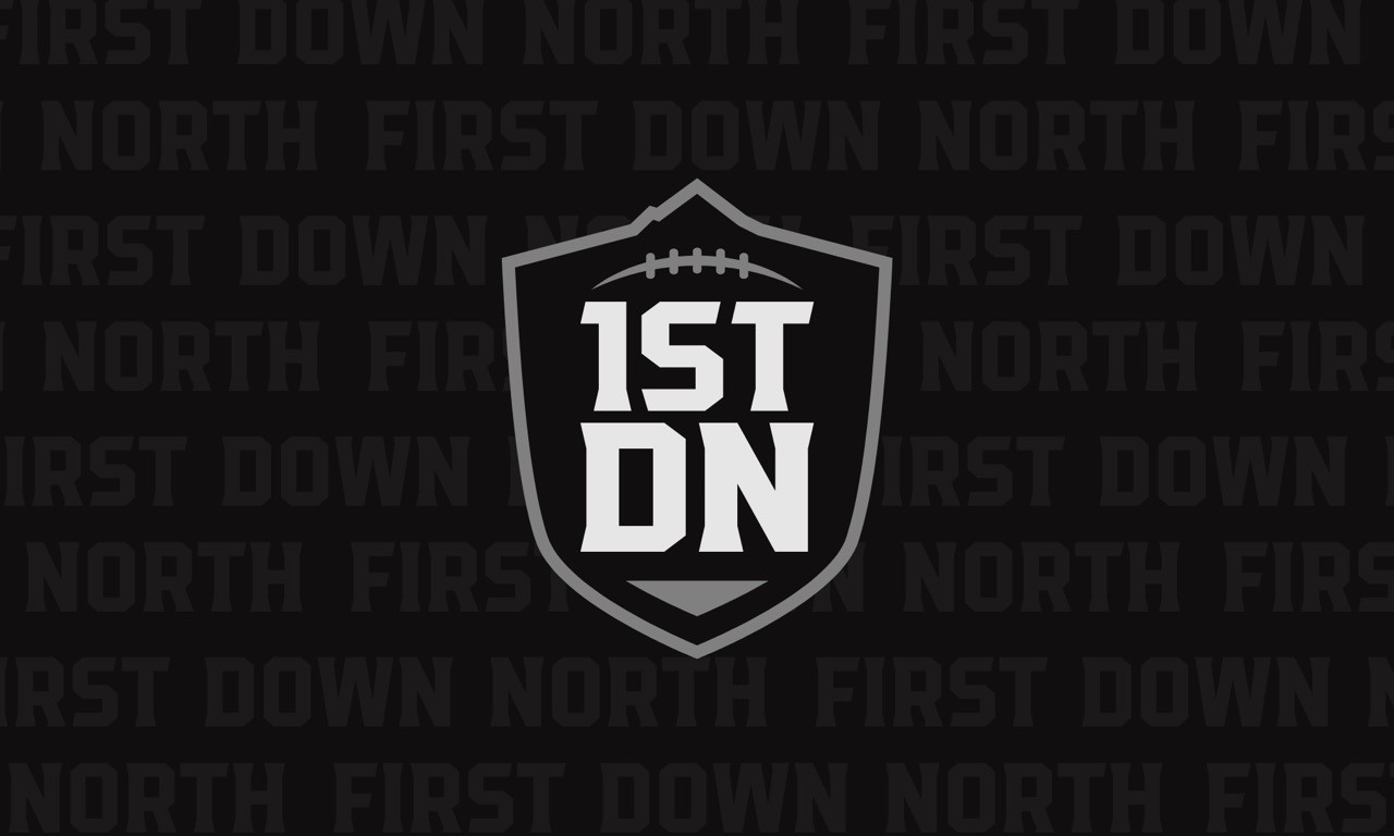
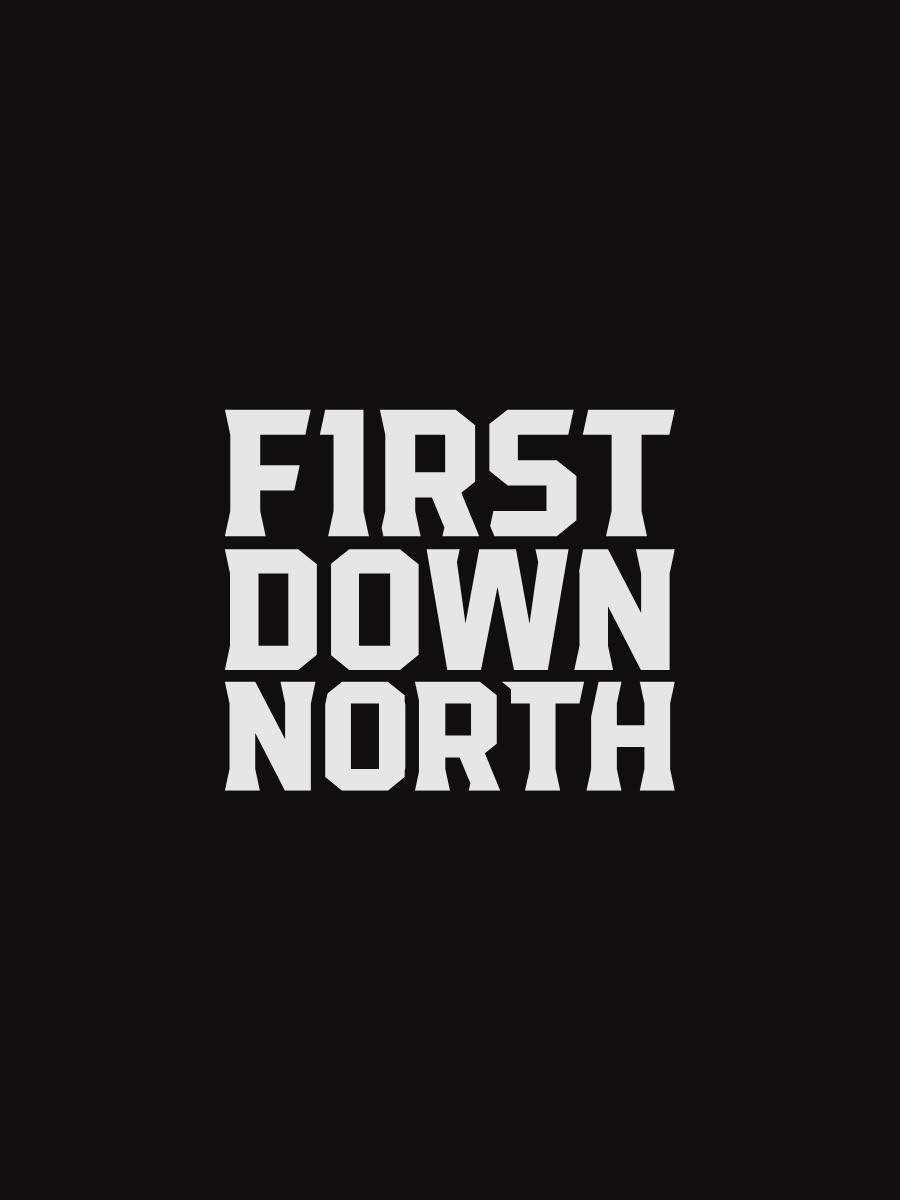
Visual Identity: First Down North
A bold and modern visual identity built for a football media platform focused on showcasing the present and future of the game in Alberta. The brand blends northern symbolism with football-driven structure to create a system that feels authoritative, recognizable, and deeply connected to the local football landscape.
Year :
2025
Industry :
Football Media
Client :
Montis Media & Wilkz Performance
Project Duration :
2 Weeks
Overview
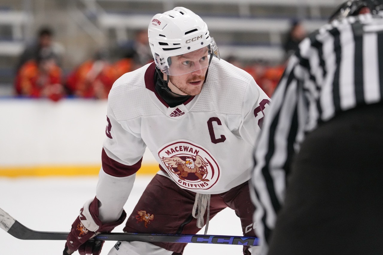
First Down North needed a visual identity that could establish credibility while standing out in the crowded world of sports media. The goal was to create a brand that felt trusted and established, while still speaking to the energy, growth, and passion surrounding football across Alberta. The identity needed to work seamlessly across digital platforms, social media, and future brand expansions.
The Design
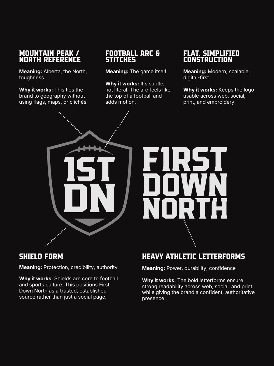
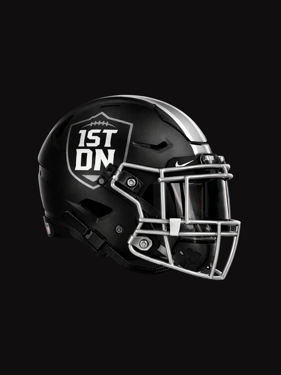
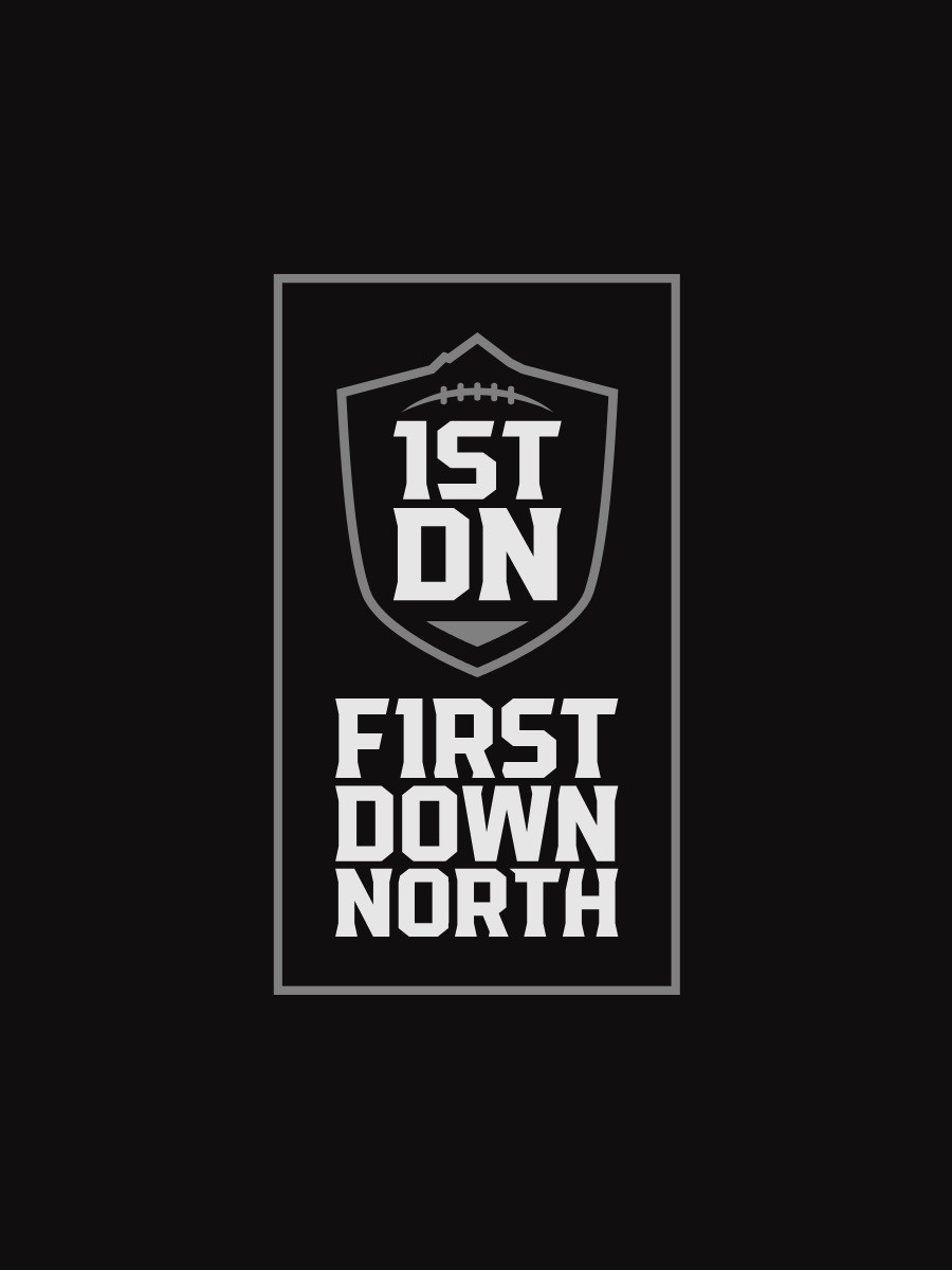
The logo is built around a strong shield form, anchoring the brand in football tradition while giving it a modern edge. A mountain-inspired peak crowns the shield, representing the North and the rugged football landscape of Alberta. Subtle football stitching is integrated into the design, reinforcing the sport without overpowering the mark. The stacked 1ST DN monogram creates a bold, balanced structure that remains clear and recognizable at any size. A clean wordmark and multiple logo variations were developed to ensure flexibility across horizontal, vertical, and stacked applications.
The Strategy
The creative direction focused on clarity, consistency, and scalability. The identity was designed to feel confident and authoritative without being overly complex, allowing the content to remain the focal point. By pairing strong athletic typography with a restrained colour palette, the brand maintains a professional presence while still feeling accessible to athletes, families, and football fans. Every element was built to perform across web, social media, and print environments.
The Meaning
At its core, First Down North represents progress, opportunity, and the next play forward. The shield symbolizes trust and structure, while the northern peak reflects the region the brand serves. The football elements ground the identity in the game itself, creating a visual language that feels authentic to Alberta football. Together, these elements tell a story of growth, resilience, and the pursuit of what comes next, capturing both where the game is today and where it is headed.

More Projects


Branding
Visual Identity: First Down North
A bold and modern visual identity built for a football media platform focused on showcasing the present and future of the game in Alberta. The brand blends northern symbolism with football-driven structure to create a system that feels authoritative, recognizable, and deeply connected to the local football landscape.
Year :
2025
Industry :
Football Media
Client :
Montis Media & Wilkz Performance
Project Duration :
2 Weeks
Overview
First Down North needed a visual identity that could establish credibility while standing out in the crowded world of sports media. The goal was to create a brand that felt trusted and established, while still speaking to the energy, growth, and passion surrounding football across Alberta. The identity needed to work seamlessly across digital platforms, social media, and future brand expansions.
The Design
The logo is built around a strong shield form, anchoring the brand in football tradition while giving it a modern edge. A mountain-inspired peak crowns the shield, representing the North and the rugged football landscape of Alberta. Subtle football stitching is integrated into the design, reinforcing the sport without overpowering the mark. The stacked 1ST DN monogram creates a bold, balanced structure that remains clear and recognizable at any size. A clean wordmark and multiple logo variations were developed to ensure flexibility across horizontal, vertical, and stacked applications.
The Strategy
The creative direction focused on clarity, consistency, and scalability. The identity was designed to feel confident and authoritative without being overly complex, allowing the content to remain the focal point. By pairing strong athletic typography with a restrained colour palette, the brand maintains a professional presence while still feeling accessible to athletes, families, and football fans. Every element was built to perform across web, social media, and print environments.
The Meaning
At its core, First Down North represents progress, opportunity, and the next play forward. The shield symbolizes trust and structure, while the northern peak reflects the region the brand serves. The football elements ground the identity in the game itself, creating a visual language that feels authentic to Alberta football. Together, these elements tell a story of growth, resilience, and the pursuit of what comes next, capturing both where the game is today and where it is headed.
More Projects
Branding
Visual Identity: First Down North
A bold and modern visual identity built for a football media platform focused on showcasing the present and future of the game in Alberta. The brand blends northern symbolism with football-driven structure to create a system that feels authoritative, recognizable, and deeply connected to the local football landscape.
Year :
2025
Industry :
Football Media
Client :
Montis Media & Wilkz Performance
Project Duration :
2 Weeks
Overview
First Down North needed a visual identity that could establish credibility while standing out in the crowded world of sports media. The goal was to create a brand that felt trusted and established, while still speaking to the energy, growth, and passion surrounding football across Alberta. The identity needed to work seamlessly across digital platforms, social media, and future brand expansions.
The Design
The logo is built around a strong shield form, anchoring the brand in football tradition while giving it a modern edge. A mountain-inspired peak crowns the shield, representing the North and the rugged football landscape of Alberta. Subtle football stitching is integrated into the design, reinforcing the sport without overpowering the mark. The stacked 1ST DN monogram creates a bold, balanced structure that remains clear and recognizable at any size. A clean wordmark and multiple logo variations were developed to ensure flexibility across horizontal, vertical, and stacked applications.
The Strategy
The creative direction focused on clarity, consistency, and scalability. The identity was designed to feel confident and authoritative without being overly complex, allowing the content to remain the focal point. By pairing strong athletic typography with a restrained colour palette, the brand maintains a professional presence while still feeling accessible to athletes, families, and football fans. Every element was built to perform across web, social media, and print environments.
The Meaning
At its core, First Down North represents progress, opportunity, and the next play forward. The shield symbolizes trust and structure, while the northern peak reflects the region the brand serves. The football elements ground the identity in the game itself, creating a visual language that feels authentic to Alberta football. Together, these elements tell a story of growth, resilience, and the pursuit of what comes next, capturing both where the game is today and where it is headed.