Branding
Visual Identity: The Play Free Project
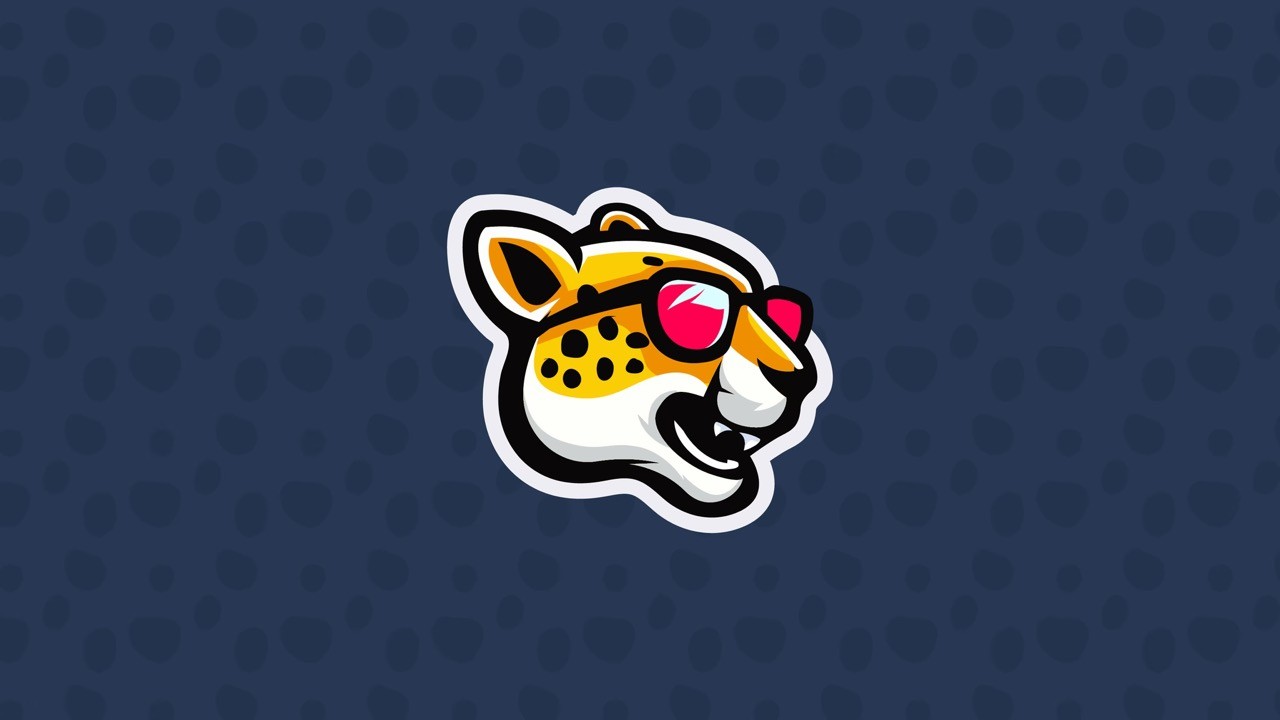
A vibrant brand identity created for a startup focused on bringing the fun back to youth sports. The cheetah mascot and bright colors capture the speed, confidence, and joy behind their mission to help every kid play freely and love the game again.
Year :
2025
Industry :
Sports/Mental Wellness
Client :
The Play Free Project
Project Duration :
2 Weeks
Overview
The Play Free Project is a startup created to inspire kids to rediscover the joy of sport. Its mission is to remind young athletes to embrace the freedom of play and focus on having fun, creativity, and self-expression. The brand needed to capture that energy and spirit in a way that feels bold, youthful, and full of life.

The Design
At the center of the identity is a cheetah wearing sunglasses, a symbol of speed, confidence, and personality. The vibrant color palette of hot pink, yellow, midnight blue, and white creates a sense of excitement and motion. The design is playful and dynamic, built to connect with young athletes and stand out across every platform.


The Strategy
The creative direction focused on building a brand that celebrates fun, individuality, and the pure love of sport. Through expressive typography and bright, uplifting visuals, the identity encourages kids to move freely, play confidently, and find joy in every moment.
The Meaning
The Play Free Project represents the freedom and passion that make sports special. It celebrates play for the sake of play, capturing the spirit of movement, friendship, and self-belief that defines why we fall in love with the game.

More Projects


Branding
Visual Identity: The Play Free Project
A vibrant brand identity created for a startup focused on bringing the fun back to youth sports. The cheetah mascot and bright colors capture the speed, confidence, and joy behind their mission to help every kid play freely and love the game again.
Year :
2025
Industry :
Sports/Mental Wellness
Client :
The Play Free Project
Project Duration :
2 Weeks
Overview
The Play Free Project is a startup created to inspire kids to rediscover the joy of sport. Its mission is to remind young athletes to embrace the freedom of play and focus on having fun, creativity, and self-expression. The brand needed to capture that energy and spirit in a way that feels bold, youthful, and full of life.
The Design
At the center of the identity is a cheetah wearing sunglasses, a symbol of speed, confidence, and personality. The vibrant color palette of hot pink, yellow, midnight blue, and white creates a sense of excitement and motion. The design is playful and dynamic, built to connect with young athletes and stand out across every platform.
The Strategy
The creative direction focused on building a brand that celebrates fun, individuality, and the pure love of sport. Through expressive typography and bright, uplifting visuals, the identity encourages kids to move freely, play confidently, and find joy in every moment.
The Meaning
The Play Free Project represents the freedom and passion that make sports special. It celebrates play for the sake of play, capturing the spirit of movement, friendship, and self-belief that defines why we fall in love with the game.
More Projects
Branding
Visual Identity: The Play Free Project
A vibrant brand identity created for a startup focused on bringing the fun back to youth sports. The cheetah mascot and bright colors capture the speed, confidence, and joy behind their mission to help every kid play freely and love the game again.
Year :
2025
Industry :
Sports/Mental Wellness
Client :
The Play Free Project
Project Duration :
2 Weeks
Overview
The Play Free Project is a startup created to inspire kids to rediscover the joy of sport. Its mission is to remind young athletes to embrace the freedom of play and focus on having fun, creativity, and self-expression. The brand needed to capture that energy and spirit in a way that feels bold, youthful, and full of life.
The Design
At the center of the identity is a cheetah wearing sunglasses, a symbol of speed, confidence, and personality. The vibrant color palette of hot pink, yellow, midnight blue, and white creates a sense of excitement and motion. The design is playful and dynamic, built to connect with young athletes and stand out across every platform.
The Strategy
The creative direction focused on building a brand that celebrates fun, individuality, and the pure love of sport. Through expressive typography and bright, uplifting visuals, the identity encourages kids to move freely, play confidently, and find joy in every moment.
The Meaning
The Play Free Project represents the freedom and passion that make sports special. It celebrates play for the sake of play, capturing the spirit of movement, friendship, and self-belief that defines why we fall in love with the game.